|
Uploaded: 6 years ago
Contributor: Guest
Category: Economics
Type: Outline
Tags: students, higher, education, college, economic, chapter, example, income, models, causes, experiment, treatment, equilibrium, discussion, variable
Rating:
N/A
|
Filename: Chapter 2.docx
(59.42 kB)
Page Count: 9
Credit Cost: 1
Views: 146
Last Download: N/A
|
Description
Acemoglu, Laibson & List, Microeconomics
Transcript
CHAPTER 2
Economic Methods and Economic Questions
I. Key Ideas
A model is a simplified description of reality.
Economists use data to evaluate the accuracy of models and understand how the world works.
Correlation does not imply causation.
Experiments help economists measure cause and effect.
Economic research focuses on questions that are important to society and can be answered with models and data.
II. Getting Started
The Big Picture
Chapter 2 emphasizes the importance of using real-world data to test hypotheses and decide which of the competing theories is most compelling. Chapter 2’s discussion of empirical methods and common pitfalls (e.g., argument by anecdote, omitted variables bias, nonrandom sampling) prepares the reader to understand the special Evidence-Based Economics sections found in each textbook chapter; a list of key economic questions by chapter is provided on page 31. For illustrative purposes, the authors construct a simple model of the returns to education.
Where We’ve Been
By reading Chapter 1, students have been introduced to an economist’s basic perspective and some common terminology, summarized here: Scarcity is everywhere, so economic agents such as households, firms, and governments must make tough decisions and face trade-offs sometimes presented in the form of a budget constraint. For each option chosen, there is a runner-up choice; we refer to (the value of) the best alternative forgone as the opportunity cost. Optimizing economic agents identify and weigh the relevant costs and benefits for each option, and choose the option with the highest net benefit. That is, when pondering whether to spend an hour per day on Facebook, a student might recognize that she is forgoing roughly $10 in wages, so a year’s worth of Facebooking implicitly costs her nearly $4,000, which could have been spent on something like foreign vacations. When two or more economic agents are optimizing, we may find an equilibrium: a situation in which no party has an incentive to unilaterally change its behavior. Economists study small pieces of the economy (microeconomics) or the entire economy (macroeconomics) and use equilibrium analysis to describe the world (positive economics) and offer advice on the choices one should make (normative economics). Finally, empiricism was introduced as the third of three pillars of the textbook (along with optimization and equilibrium), so students are ready for Chapter 2’s more detailed treatment of empirical methods.
Where We’re Going
Armed with a basic understanding of decision-making economic agents, systems of multiple, self-interested agents in equilibrium, and some empirical issues, we turn next to an in-depth look at optimization in Chapter 3. Building around a person’s choice of how close to live to her job in the city center, the authors develop a cost-minimization model that considers both living costs (apartment rent) and commuting costs (based on gas prices and distance from the apartment to her job). Thousands of like-minded potential tenants compete to rent scarce apartments, generating equilibrium rental rates. This discussion of the market for living space sets up the reader to apply Chapter 2’s empirical insights as s/he learns more about supply, demand, and equilibrium in the next four microeconomic chapters:
Chapter 4 Demand, Supply, and Equilibrium: Brazil heavily taxes gasoline, Mexico modestly subsidizes it, and Venezuela aggressively subsidizes it, so the quantity of gasoline demanded in the three nations varies significantly, and it is negatively related to the effective price, as the Law of Demand predicts.
Chapter 5 Consumers and Incentives: In the Philadelphia Veterans Affairs experiment, volunteer smokers offered $100 to quit smoking for a month had a much higher quit rate than those who were not offered a financial incentive; smokers who did not quit effectively gave up $100 of increased income that could have been spent on other goods and services.
Chapter 6 Sellers and Incentives: After President George W. Bush promoted ethanol in his 2006 State of the Union Address, the number of new plants under construction or expansion rose and the number of ethanol plants rose; experimental evidence confirms that production subsidies encourage production.
Chapter 7 Perfect Competition and the Invisible Hand: Field experiments of markets show that observed prices quickly converge to the equilibrium price predicted by economic theory, showing that Adam Smith’s invisible hand metaphor is alive and well.
Number of Lectures
Chapter 2’s material can be covered adequately in one 50-minute lecture. Here are the essential elements:
Introduce key question: Is college worth it? [5 mins.]
Scientific methods, why build models, examples of models [5 mins.]
Introduce the basic returns-to-education model; show EBE’s Exhibit 2.3 [10 mins.]
Empirical Issues: argument by anecdote, correlation versus causation, omitted variables, reverse causality [15 mins.]
Empirical Methods: experiments, test versus control groups, randomization, natural experiments [10 mins.]
What makes a good economic question? [5 mins.]
Opening Question and Evidence-Based Economics
“Is college worth it?” This question should resonate with most students, not only because they are currently investing substantial time, energy, and money in a college education, but also because they might wonder whether it makes sense to pursue a graduate degree. In the past few years, we have read more and more headlines about the rising cost of higher education and whether it adequately prepares college graduates for the working world. This chapter helps frame that discussion and prepares the student for Chapter 11, which covers hiring decisions and the relationship between labor productivity and wages.
This issue is complicated by the fact that college financial aid officers are skilled at using first-degree (perfect) price discrimination, which is covered in Chapter 12. It could be the case that the 30 students in a class are each being charged a different price for their college education.
III. Chapter Outline
2.1 The Scientific Method
To better understand the world, economists develop models, gather relevant data, and then use that data to evaluate the models. Economists expand the models that seem better at explaining or predicting outcomes, while reworking or discarding the inferior models, and then repeat the entire process with new and improved models.
Teaching Ideas: At some point in the term one might compare economics and physics, which are arguably the most rigorous of the natural and social sciences, respectively. Both use models, optimization, and equilibrium concepts, but it’s easier to study the interaction of two billiard balls than the interactions of two human subjects, who may be aware that they are the subjects of a study; a person asked to “act normally” may become self-conscious and behave in unusual ways.
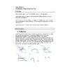
Models and Data—The authors use the topic of navigation to weigh the advantages and disadvantages of using two-dimensional maps, like those shown in Exhibits 2.1 and 2.2. Determining an optimal flight path is better done with a three-dimensional globe than a two-dimensional world map, but the two-dimensional subway map is very useful for subway commuters.
Models omit unnecessary details, but what is unnecessary varies from user to user. One can imagine whether a single city map could help one identify city parks (for the noisy kids in the back seat), low-traffic bike routes, post office drop boxes, public drinking fountains, streets appropriate for a heavy dump truck, or addresses of celebrities. Interestingly, Google Maps can accomplish many of these tasks, though it is not a standard printed map.
Alternative Teaching Examples: One might ask a class to imagine trying to model the trajectory of a stuffed toy (e.g., a Sesame Street Elmo doll) thrown out of a third story window. Could we replace Elmo with a sphere or cube with the same mass? Does wind speed matter? Does it matter that the Earth isn’t technically flat?
An Economic Model—The simple returns-to-education model assumes that investing in one extra year of education increases your future wages by 10 percent; this model predicts that those with higher educational attainment will have higher income, on average. This model is an approximation that ignores many subtleties about the labor market but does generate a prediction that can be tested empirically if one has sufficient data on years of education and wages.
Alternative Teaching Examples: One could launch a fruitful discussion by asking some of the following questions:
Will your wages rise 10 percent if you stick around for the fifth year of college?
Why might employers be willing to pay higher wages to workers with more educational experience? Would all employers do this?
One sometimes hears that averages mask variation. What does this mean? One could explain this by showing students’ two very different distributions of exam scores that have the same mean but very different standard deviations. For example, both (90, 70, 50) and (72, 70, 68) have average scores of 70, but the first distribution is spread out much more than the tightly bunched second distribution. If one only learns the average score, then one cannot tell much about how much the scores varied. Another example one might choose to use is in Chapter 12. When discussing monopoly and antitrust economists prefer the Herfindahl-Hirschman Index (HHI) to the concentration ratio; the former is a sum of the squared market shares, whereas the latter is a sum of the market shares, so two very different market structures can give different HHIs but identical concentration ratios.
Starting now, how many additional years of education would you need to roughly double your wage? (Seven! One might introduce the Rule of 72, which says that if you divide 72 by the percentage growth rate, your answer is a good approximation of the number of periods needed to double your wage. So if your wage grew 4 percent each year, it would double in about 72/4 = 18 years, whereas if it grew at 8 percent, it would double in about 72/8 = 9 years. This is an easy rule of thumb to remember, and fun math tricks like this help the math-phobic students settle in and recognize the value of learning a bit of math.)
Does it matter where one obtains education? (Does all education count?)
Someone who started working right out of high school may have four years of experience by the time another person is graduating from college. Does the college graduate start at a higher wage immediately, or start at a lower wage, but then quickly catch and exceed the wage of the high school graduate?
You might recognize the future value formula from finance. If X is principal, r is the discount rate (or growth rate), and t is the number of periods, then the future value is given by:.
Evidence-Based Economics: How much more do workers with a college education earn? With public-use data from the Current Population Survey, the authors used data on wages and education to determine average salaries for 30-year-old workers with either 12 or 16 years of education. The actual ratio of the average wages (college wage divided by high school wage) is 1.57, whereas the basic returns-to-education model predicts a theoretical ratio of 1.46, which is very close.
For discussion: Why did the authors choose to compare 30-year-olds rather than workers of a different age? Why did they get such ugly numbers, like $32,941?
For a nice collection of economic data, a student may explore FRED (Federal Reserve Economic Data) at http://research.stlouisfed.org/fred2/.
Means—The average wage is the sum of wages divided by the number of wages added. The more observations used in statistical analysis, the stronger the empirical argument.
Easy examples: Average height of all students in the classroom; a student’s overall grade point average
Tougher examples: Average net worth of all Americans. If your college considers a standard full-time course to be worth one credit, how do you compute your quarterly GPA when you took 3.5 credits?
Argument by Anecdote—Harvard dropouts Bill Gates (Microsoft founder) and Mark Zuckerberg (Facebook CEO) seem to be an exception to the rule: Both are billionaires despite having less than 16 years of education. However, for the vast majority of workers, higher educational attainment means higher income. One should be wary when someone uses a tiny sample—such as two observations—to draw a general conclusion.
Common Mistakes or Misunderstandings: Exhibit 2.4 shows annual earnings for a sample of two atypical 30-year-olds. One could display this along with a bell curve of income levels from a population of 30-year-olds of a particular education level and say that if you take a single random observation, who knows what you’ll get, but as your random sample size increases, the sample mean income should become increasingly similar to the population mean income. If you aren’t sampling randomly, then you could pick a series of outliers and get just about any desired result. In short, now is a good time to provide some basic intuition about statistics. If students seem bored with income, replace it with economics exam scores and watch their ears perk up.
Emphasize that an anecdote can disprove an all or nothing claim, but it cannot prove an all or nothing claim. For that matter, when we talk about statistics, the word “prove” is usually not as appropriate as “supports.”
2.2 Causation and Correlation
If two things (A and B) move together, then it could be the case that A causes B, B causes A, each causes the other, or the two are independent and the co-movement is coincidental. This section helps us sort out the possible relationships.
The Red Ad Campaign Blues—A firm’s red-themed ad campaigns seem to outperform blue-themed ad campaigns, but if the former occur primarily during the Christmas season while the latter are mostly spread out over the year, then the crowds of Christmas shoppers are more likely responsible for a boost in sales than the red-themed ads. Red-themed ads and sales increases are correlated, but the red-themed ads don’t cause sales increases, so correlation does not imply causation.
Common Mistakes or Misunderstandings: Some students will not know the difference between sales and profits, or that in most simple economic problems, we treat sales and revenues as synonyms. We’ll address revenues later in the book, but for now, sales = (price per unit)(units sold). For example, if Walmart sells 1,000 shirts for $5 each, then its sales are ($5)(1,000) = $5,000. Profit is the difference between revenues and costs, so it considers not only inflows, but also outflows.
Causation versus Correlation—When two things are mutually related and move together, then there is correlation, but not necessarily causation. Correlation can be positive (heatstroke cases rise when the temperature rises), negative (frostbite cases fall when the temperature rises), or zero (the formula for the area of a circle remains unchanged when the temperature rises). Complicating our efforts to determine the direction (if any) of causation for two correlated variables are the problems of omitted variables and reverse causality.
In the example above, the omitted variable is the Christmas season: sales increases are caused by Christmas shopping, not the color of the red-themed ads.
Reverse causality occurs when we assume A causes B, but it could be the case that B causes A, or the causality runs in both directions. The book gives the example of the wealth-health bi-directional causality: Healthy people may work harder and attain higher wealth, and wealthier people may afford better health care, so health causes wealth and vice versa.
Where are we going with this? Soon we’ll discuss supply and demand and argue that each is a function of many variables. For example, the quantity demanded of strawberry jam is correlated with (and caused by) the strawberry jam price, the grape jelly price, the peanut butter price, the bread price, our preferences about consuming foods with high sugar content, and average household income, among other things.
Experimental Economics and Natural Experiments—To set up an economics experiment, researchers gather a large set of human subjects and randomly assign them to either the control group or the test (treatment) group; the two groups are treated similarly, except that the treatment group gets the treatment while the control group does not. For example, the only difference between the two groups in a drug testing experiment is that the treatment group gets the new drug, while the control group gets the old drug (or a placebo). In a natural experiment, the investigator needn’t design the experiment because an event or policy has effectively created control and treatment groups in a (nearly) random way.
This is an opportunity to discuss the importance of careful experiment design; it would be a shame to invest many resources in a study just to find that the results are not believable because of a fundamental design flaw. For example, because not all people have telephones, one would doubt the results of a study on poverty that used data collected by telephone surveys.
For discussion: Why might it be important for an experiment participant to be unaware of whether s/he is in the control group or the treatment group?
2.3 Economic Questions and Answers
A good economic question addresses an issue that affects social welfare and is a question that can be answered. The authors introduce a long list of good economic questions that will be answered in this book, one per chapter.
If it is the case that we want to get students interested in research, then our standards are probably lower, as there is much that can be learned from doing research, even if the topic isn’t popular or there is a struggle in determining how to answer it.
This is an opportunity to show the range of topics that economics can handle!
Evidence-Based Economics: How much more do wages increase when an individual is compelled by law to get an extra year of schooling? An education reform law in the United Kingdom in 1947 raised the legal dropout age from 14 to 15, creating a natural experiment. Students turning 14 before 1947 could be considered a control group whereas students turning 14 in or after 1947 would be the treatment group. By comparing income levels, a researcher found that those compelled to stay in school an extra year earned 10 percent more on average.
Some students may wonder why researchers don’t study a U.S. state in 2010 rather than the UK in 1947. The answer is that empirical researchers must often take what data they can get; an ideal, modern dataset may not be available.
Appendix
Constructing and Interpreting Graphs—This is a very important skill to develop, not only to do well in an economics course, but also to improve one’s ability to digest the news and get along in society.
A Study About Incentives—The authors mention whether a student might spend more time studying for a class if s/he were paid a bonus of $50 or $500 for earning an A. This might be the topic of an interesting discussion: When is it appropriate to use financial “carrots or sticks” to change behavior? What size of a reward or penalty is necessary to get the desired behavioral change?
Experimental Design—The authors describe an experiment in which some Chicago Heights high school students (or their parents) were given $50 monthly rewards for achieving particular academic performance goals. One might ask his/her class what they predict the results to be from this incentive scheme. Also, would the students in the instructor’s economics class put in more effort if given a financial incentive?
Describing Variables—There are four commonly used ways to graphically describe data. The aptly named pie chart breaks up a variable into various categories, with the size of each “slice” indicating the percentage of the whole. A bar chart makes it easy to compare a single variable across multiple categories, which are displayed as parallel bars, the length of the bar representing the value of the variable. To see how a variable changes over time, we use a time series graph, which features many points, each mapping a point in time to a value of the variable. Finally, we use a scatter plot to show how two variables are related.
For discussion:
When would you expect to see a pie chart with two equally sized slices?
What does it mean if you have a bar chart with equally long bars for the control group and the treatment group in some experiment?
What would a time series graph look like for a seasonal data series, such as monthly sales or monthly swimming beach use?
What is an example of two variables for which the scatter plot looks like a swarm of points with most of the points in the upper left, middle, and lower right of the graph?
Cause and Effect—From a public policy perspective, economists are interested in causal relationships; it would be nice to know, for instance, if higher education spending led to higher academic test scores, higher graduation rates, higher post-graduation incomes, or longer life expectancy. Finding correlations is a first step in establishing causality, but there is more work to be done so we don’t fall into the trap of assuming that correlation implies causality; it does not! As noted in Chapter 2, an omitted variable might cause two things to move together. A humorous application of this is found in Exhibit 2A.6, where it looks like ice cream sales are linked with drownings; the key insight is that hot weather causes increases in both ice cream sales and swimming activity, and more swimmers, not additional ice cream consumption, leads to more drowning.
Teaching Ideas: Students might enjoy coming up with other twists on this theme of two apparently related things as a result of an omitted variable. For example, unseasonably hot weather also causes higher electricity use (for air conditioning), increased sales of fans, sales of other cold consumables (soda, beer, ice), etc. The recent winter was unusually cold; what are some predictable results from that natural phenomenon?
VI. Active Learning Exercises
1. (Causation and Correlation) Many professors notice that the students who sit in the first or second row in the classroom frequently earn higher grades in the course than students who sit toward the back of the classroom. Should professors view this relationship as one of causation? As one of correlation? Explain your answer.
Solution: While there is a positive correlation between where students sit and their grades in class, it is not clear that sitting in the front causes higher grades. This may be a case of reverse causality where students who take the class more seriously are the students who choose to sit close to the professor. While there may be benefits to sitting in the front, such as clearly seeing the board, fewer distractions, and pressure to pay attention as the professor can watch your behavior, most students do not randomly sit in the front rows. Instead, the students often have a particular interest in the course.
2. (Means) Suppose there are six students in the class and the individual test scores are: 80, 90, 74, 92, 96, and 84. Calculate the mean test score for the class.
Solution: The mean (or average) is calculated by the summing the scores (80 + 90 + 74 + 92 + 96 + 84 = 516) and dividing by the number of observations (6). Therefore, the mean is 86.
|
|