A
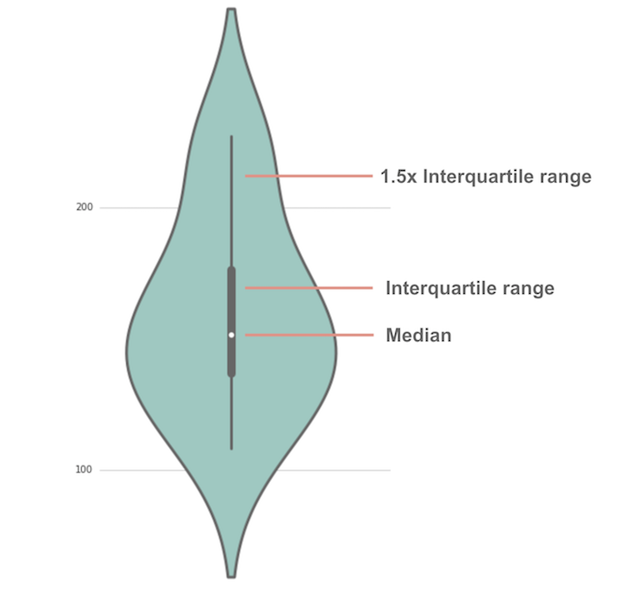
violin plot is the blend of a
box-and-whisker plot and
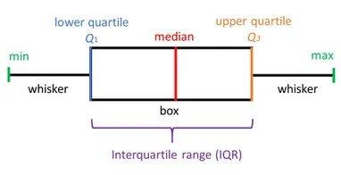
kernel density estimate (KDE), but shows a lot more than a box-and-whisker plot (shown below).

While a box plot only shows summary statistics such as mean/median and interquartile ranges, the violin plot shows the
full distribution of the data, as well as summary statistics.
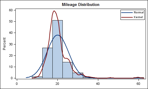
A KDE is the estimation of the unknown density function of the distribution of data. Basically it estimates the unknown density function with the following formula:
 K is the kernel — a non-negative function — and h > 0 is a smoothing parameter called the bandwidth.Benefits of KDE:
1. It can tell us whether is normally distributed or not
2. Whether the data is skewed or not
3. Whether has high variance

Here using KDE we can say that the data is not skewed, approximately normal, the data have not had high variance, etc.
In a violin plot, a KDE plot can be found on both sides of the spinal cord of the plot.
Box plots are not affected by the data’s distribution. When the data “morph” but manage to maintain their stat summaries (medians and ranges), their box plots stay the same whereas the violin plot not only shows the summary statistics it also shows how the data got distributed. It changes its nature greatly as the distribution of data changes.
If the violin got bigger then we can say that the has high variance neatly as compared to the box plot.
